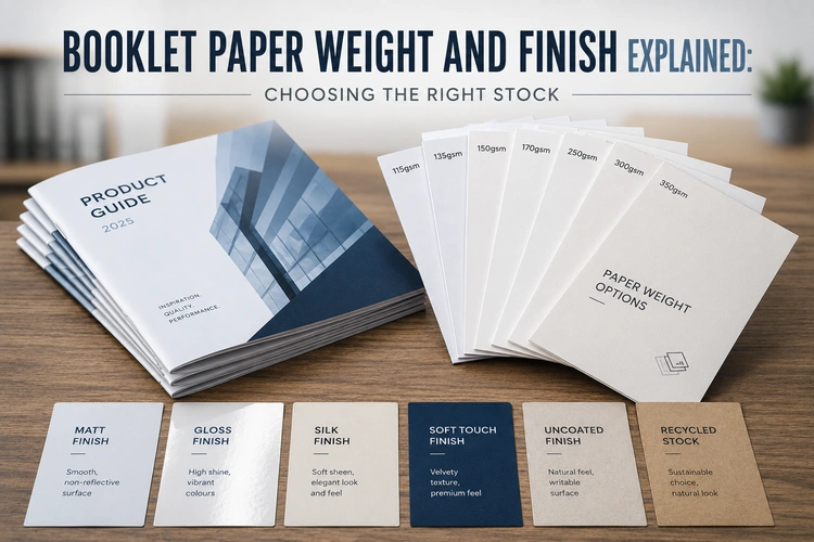
Paper stock is one of the most consequential choices you’ll make when ordering a booklet — and one of the least well explained. When you’re configuring saddle-stitched booklets online, the options can feel like a list of numbers to guess at. This guide explains what those numbers and finish names actually mean: what different weights feel like in the hand, how finish affects the way your content reproduces on the page, and how to pair cover and inner stocks without running into common problems.
The gsm figure and the finish name look like technical specs. In practice, they determine three things that readers notice immediately, even if they can’t articulate why.
Tactile impression. The weight of paper communicates quality before a single word is read. A booklet printed on 90gsm uncoated stock and one printed on 150gsm silk with a laminated cover contain the same content — but they feel entirely different to pick up. One feels provisional; the other feels considered. That difference shapes how the reader approaches what’s inside.
Ink holdout and colour reproduction. Coated papers (silk and gloss) have a surface treatment that prevents ink from being absorbed too deeply into the fibres. This keeps dots sharper, colours more saturated, and image detail crisper. Uncoated papers absorb ink more readily, which softens edges and slightly mutes colours — sometimes desirable, often not. For image-heavy booklets, the choice of finish is as important as the gsm.
Show-through. On lighter inner page weights, ink from the reverse side of a page can be faintly visible. On 90gsm, this is noticeable in areas of heavy ink coverage. On 130gsm and above, it’s rarely a problem. Knowing where the threshold sits for your content — particularly if you have full-bleed imagery or dark backgrounds — helps you avoid an unpleasant surprise.
For saddle-stitched booklets, inner pages typically run from 90gsm to 170gsm. Here’s what each part of that range delivers.
90gsm is the lightest practical weight for booklet inners. It’s economical, keeps the booklet lightweight for posting, and works acceptably for text-heavy content with limited full-colour imagery. Show-through is the main risk — if your layouts have dark backgrounds or full-bleed photography, 90gsm will let the reverse side show through. Best suited to newsletters, price lists, and internal documents where cost per copy matters more than tactile quality.
115–130gsm is the most common range for commercial booklets. It handles full-colour imagery cleanly, shows minimal show-through even with heavy ink coverage, and still folds neatly without stiffness. A 20-page A5 booklet on 130gsm silk inners feels solid and professional without becoming bulky. For most marketing brochures, event programmes, and product catalogues, this range is the right starting point.
150–170gsm is the premium inner weight range. Pages feel noticeably heavier and more substantial in the hand, image reproduction is excellent, and the booklet has a presence that lighter stocks don’t. The trade-off is page count: thicker inner pages make the spine bulkier, which lowers the practical maximum for saddle stitching. On 170gsm, a 32-page booklet is comfortably within range, but a 64-page booklet becomes difficult to fold and staple cleanly. Higher inner weights also increase postage weight if you’re mailing in volume.
Cover stock for saddle-stitched booklets typically runs from 250gsm to 350gsm, and the instinct to go as heavy as possible isn’t always right.
250–300gsm covers give a clear step up from the inner pages in weight and rigidity, which is what most buyers want — a cover that holds its shape and protects the contents. A 300gsm silk cover with a matt laminate is a reliable, professional choice for the majority of commercial booklets.
350gsm covers are noticeably thicker and stiffer. For a booklet with a substantial page count — say, 48 pages — this works well. But on an 8-page or 12-page booklet, a very heavy cover creates a different problem: the booklet becomes difficult to close flat. With only a few folded sheets inside, there isn’t enough body to counteract the rigidity of the cover, and the booklet springs open. For low page-count booklets, a 250gsm cover is often the better choice.
Self-cover is an option worth knowing about: instead of a separate heavier cover stock, the entire booklet — including the cover pages — is printed on the same inner stock. This is cost-effective and works well for newsletters, internal documents, and any booklet where a clear cover/content distinction isn’t needed. The trade-off is that the cover offers no additional durability, and lamination isn’t available on self-cover booklets.
For booklets with very high page counts that need a heavier, spine-printable cover, that’s typically the point where perfect binding becomes the more appropriate format — our saddle stitch vs perfect binding guide covers when that threshold is reached.
The finish of your paper affects colour reproduction, how comfortable the page is to read, and how the booklet feels to handle. These are distinct from the weight — a 130gsm sheet is available in silk, gloss, and uncoated variants, and the difference between them is significant.
Silk is the most widely used finish for commercial booklets. It has a low-sheen coating that enhances colour reproduction and keeps images sharp, while avoiding the high reflectivity of gloss. Text is comfortable to read under most lighting conditions. Silk handles well without showing fingerprints prominently. For booklets that mix photography and body copy — brochures, catalogues, programmes — silk is the default choice for good reason.
Gloss has a higher-sheen coating that makes colours more saturated and vivid. Photography in particular benefits from a gloss finish. The trade-off is readability: gloss reflects light more strongly, which can make text-heavy pages tiring to read in bright or uneven lighting. Gloss is the right choice when the booklet is primarily visual — a portfolio piece, a lookbook, a properties brochure where images do most of the work. It’s less suited to documents where extended reading matters.
Uncoated paper has no surface treatment. Ink absorbs into the fibres, which produces a softer, slightly muted print result. Colours appear less saturated than on coated stocks, and fine photographic detail is less crisp. What uncoated paper gives back is a tactile, natural feel that some audiences and brands respond to strongly. It’s the right finish for booklets that are meant to feel considered rather than commercial — and for documents that recipients will write on or annotate, since pens and pencils work on uncoated surfaces in a way they don’t on coated ones. It’s also the standard choice for recycled stocks.
Lamination adds a thin film to the outer surface of the cover, which changes both how the booklet looks and how durable it is. It’s an option for the cover only — inner pages are not laminated.
Matt laminate gives a smooth, low-sheen finish that softens the look of the cover and makes it feel more refined. It reduces glare, handles well, and gives the booklet a quieter, more considered aesthetic. It’s the most popular laminate choice for B2B marketing materials. One practical note: matt laminate can show light scuff marks on very dark or solid-colour cover backgrounds — worth knowing if your cover design is predominantly black or dark navy.
Gloss laminate adds a high-shine finish that makes cover colours more vivid and gives the booklet a visual impact on first impression. It’s more resistant to visible scuffing than matt. The look is more overt and commercial — right for some contexts, less appropriate for others.
Soft-touch laminate (sometimes called velvet) is a premium finish that gives the cover a distinctly tactile, almost suede-like surface. It’s significantly more expensive than matt or gloss, but the difference is immediately noticeable in the hand. For a booklet where physical impression matters — a high-value client-facing piece, for example — soft-touch laminate is one of the most effective ways to elevate the finished result.
For implications of laminate choice on your artwork file — particularly relevant for dark backgrounds and soft-touch — see our artwork setup guide for saddle-stitched booklets.
Use this as a starting point when speccing your booklet. Most jobs will fall cleanly into one of these three profiles.
| Budget / functional | Standard commercial | Premium / brand-led | |
|---|---|---|---|
| Inner weight | 90–100gsm | 115–130gsm | 150–170gsm |
| Inner finish | Silk or uncoated | Silk | Silk or uncoated |
| Cover weight | 250gsm or self-cover | 300gsm | 350gsm |
| Cover finish | No laminate or gloss lam | Matt or gloss laminate | Soft-touch or matt laminate |
| Typical use | Newsletters, price lists, internal comms | Marketing brochures, programmes, catalogues | Client presentations, award entries, premium brand pieces |
| Page count range | Any | 8–48pp | 8–32pp (heavier inners limit folding range) |
If sustainability is a factor in your stock choice, recycled and FSC-certified paper options are available for inner and cover — see our guide to eco-friendly booklet printing for an honest look at what those options involve and how they compare to standard coated stocks.
Once you know your inner weight, cover weight, and finish, you can configure and price your saddle-stitched booklets directly online. If you’d like a sample pack to feel the paper stocks before committing, Better Printing offers free samples — worth requesting before a first order on a client job or a high-volume run.

